White is the obvious choice. And sometimes it’s the best choice too. 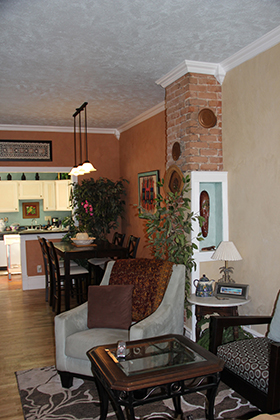 White overhead tends to disappear, so your attention focuses on the walls and furnishings. A white ceiling also offsets intense wall color. Boldly colored walls look crisp and sharp, and the ceiling feels higher. If the walls are pale and therefore space-expanding, a white ceiling opens the space even more. Like any other color element in the room, a white ceiling needs an echo, something to help integrate it into the scheme. Woodwork, carpet, draperies, and even bedding can serve the purpose. Otherwise the room will feel out of balance.
If dark ceilings don’t suit your style, consider pastels or mid-tones. A hue that’s lighter than or equal to the value of the walls will seem to rest lightly on the room. Soft spring green, pale aqua, or light blue floating above warm yellow walls creates a sunny, cheerful effect. Blue or aqua suggests the sky and recalls the Southern tradition of painting porch ceilings light blue to enhance the cooling effect of shade.
How do you decide which colors to use? Let your drapery or upholstery fabric guide you in selecting both wall and ceiling colors, and you’ll automatically have a visual link tying the surfaces and furnishings together. Don’t worry about matching paint to fabric exactly; if the colors are close, the combinations will work. As a general rule, if you want warm color on your walls, choose a cool accent color from the fabric to use on the ceiling. Conversely, if you prefer a cool color for the walls, apply a tint of a warm color from the fabric to the ceiling. This balancing act keeps the scheme interesting and satisfying.